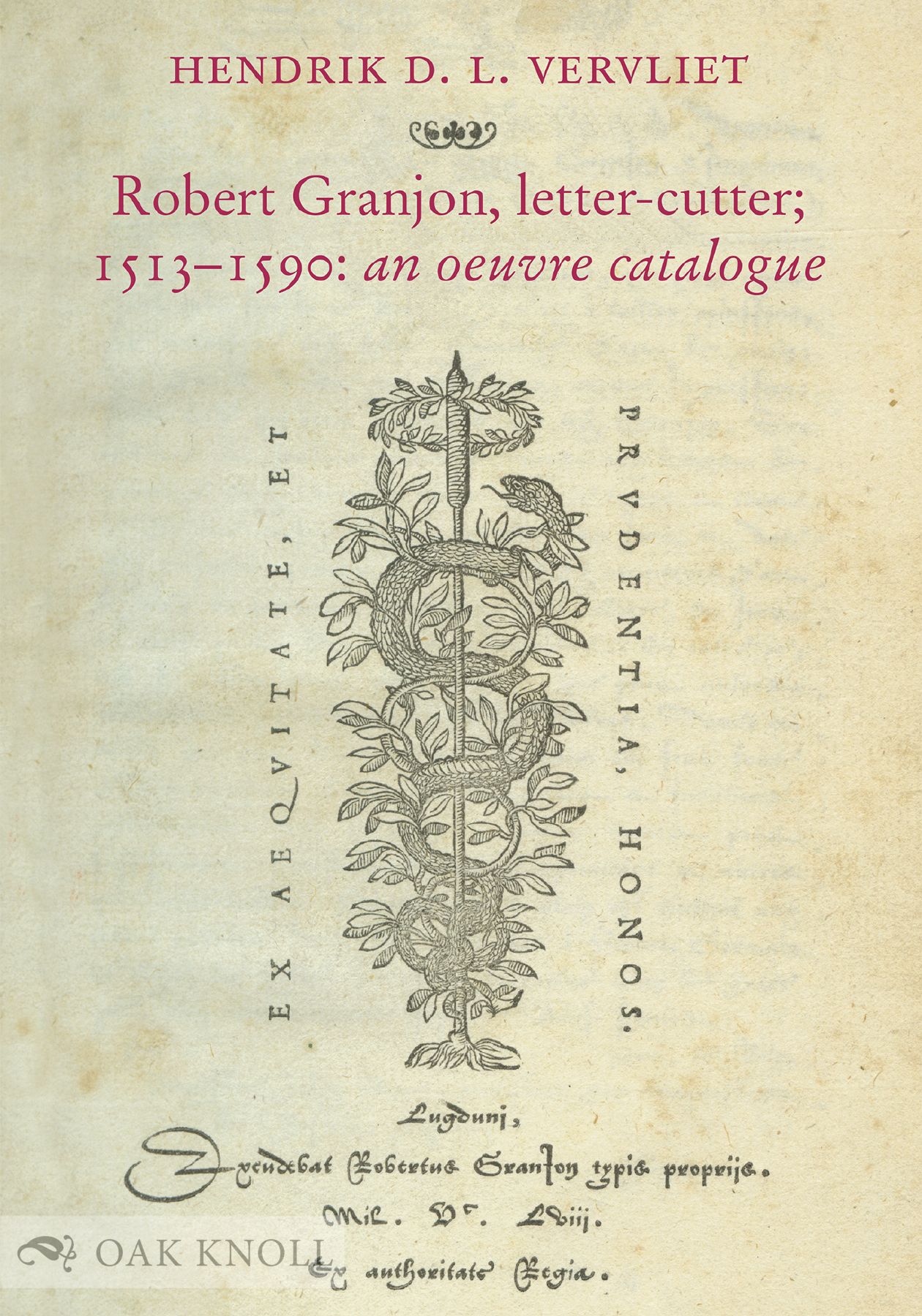
Hendrik D.L. Vervliet, Robert Granjon, letter-cutter; 1513–1590: an oeuvre catalogue. Oak Knoll Press, New Castle, DE, 2018, hc, 200 pp., US $75.00, ISBN 978-1584563761, oakknoll.com/pages/books/131957.
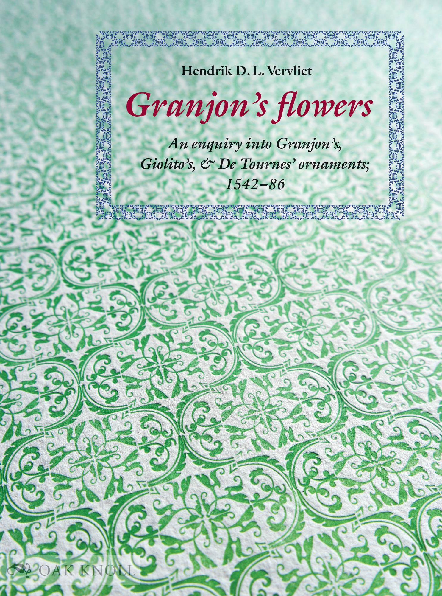
Hendrik D.L. Vervliet, Granjon’s Flowers: An Enquiry Into Granjon’s, Giolito’s, and De Tournes’ Ornaments, 1542–1586. Oak Knoll Press, New Castle, DE, 2016, hc, 248 pp., US $65.00, ISBN 978-1584563556, oakknoll.com/pages/books/127576.
These two books tell us essentially all that we know of the illustrious sixteenth century French type designer Robert Granjon. Thanks to six decades of meticulous research by Hendrik D. L. Vervliet, Granjon can now be ranked not only among the finest letter-cutters1 of the French Renaissance but among the greatest of all time. Granjon was both astonishingly versatile and amazingly productive, cutting around ninety fonts, including romans, italics, and cursive blackletters in the Latin alphabet, as well as Greek, Cyrillic, Arabic, Armenian, Hebrew, and Syriac among non-Latin scripts. He also cut music fonts and ornamental printers’ flowers. Vervliet quotes Giambattista Bodoni, writing two centuries after Granjon’s death, that: “Maestro Robert Granjon was the best letter-cutter ever.” Bodoni, a preeminent type artist himself, prized regularity, clarity, good taste, and grace in type design and evidently saw those qualities in Granjon’s work.
The sixteenth century has been called the Golden Age of Typography; the most famous letter-cutter of the era was Claude Garamond, renowned for his roman types. More than fifty digital type families today are named Garamond or Garamont, though many are not based on Garamond’s actual designs.
Granjon’s name, though well known in his time, is borne today by only one type family, which combines a roman based on a Garamond design with an italic based on a Granjon design. The only type family today that authentically, and brilliantly, embodies both Granjon’s roman and his italic designs is not named “Granjon” but “Galliard”, the English spelling of “Gaillard”, the original name of a small (around 8 point) roman that Granjon cut around 1570. (This review is typeset in Galliard, both roman and italic.) Before and during Granjon’s early career, italic was often used in body text instead of roman, but later, italic was used in subordination to roman—usually a Garamond roman with a Granjon italic. By the seventeenth century, italic was commonly paired with roman in type families, a practice continuing to present. Hence, though Granjon’s italics have often been imitated in Garamond type revivals, they are typically known as “Garamond Italic”.
Perhaps paradoxically, the subordination of italic to roman gave Granjon greater freedom of expression and invention in cutting italics, which could be more exuberant and stylish because they did not need to support fluent reading of long texts. Granjon cut some thirty different italics in at least three different styles. His “pendante” or “couchée” is a strongly slanted style that has most often been revived as a companion to Garamond romans. His “droite” is a narrower and more upright style, revived and modified by Jan Tschichold for Sabon, a modern revival of Garamond roman and Granjon italic, produced for Monotype and Linotype hot-metal composition machines and then adapted to photo- and digital type. A third italic style of Granjon resembled models of Italian chancery cursive like those of writing manuals by Arrighi and Tagliente. This chancery style is the italic in the Galliard family.
In addition to plentiful details, dates, and examples of Granjon’s typefaces, Vervliet provides a biography of the man. Robert Granjon was born around 1513 in Paris, son of a bookbinder and publisher. He was apprenticed to a goldsmith and afterward turned to letter cutting. The earliest types reliably attributed to him are a Roman on “Long Primer” body (≈ 10 point today) in 1542 and an Italic on “English” body (≈ 14 point today). Though working in Paris from around 1542 to 1552, Granjon traveled to Lyons and sold types to printers there, especially Jean de Tournes, for whom he also cut some exclusive types. Around 1553, Granjon moved to Lyons and later married Antoinette Salomon, daughter of Bernard Salomon, an eminent illustrator, engraver, and book designer for De Tournes. He apparently left Lyons around 1562, worked for a time in Geneva and Strasbourg, and in 1564 moved to Antwerp, where he sold types and custom cuttings to Christophe Plantin, known as the king of printers. Granjon moved back to Paris in 1570, to Lyons from 1575 to 1578, and then to Rome, where he cut punches for some two dozen non-Latin types and printers’ flowers for the Vatican, until a few months before his death in 1590.
The types of Granjon became internationally popular when French romans and italics, betokening fashionable Renaissance humanism, became popular not only in France, but also in Italy, Switzerland, Spain, and the Low Countries. In his first ten years of letter-cutting in Paris, Granjon cut around 24 fonts: 11 romans, 9 italics, 2 Greeks, and 2 musics, and 12 fleurons (typographic “flowers” or ornaments). These amount to some 2,500 punches, averaging 250 punches per year, an impressive number considering that he also cast (“founded”) some of his types and was also a publisher, producing around 14 books, including works of religion, science, history, music, and literature. He spent nine years in Lyon, cutting around 2600 punches, including 10 fonts of italic, 4 Greeks, 2 Civilités (a cursive French blackletter), 4 musics, 12 sets of fleurons, and two sets of large script initials (the models cut in wood and cast in sand).
By the time of his death, Granjon’s italics dominated European humanist (non-blackletter) typography. In Christophe Plantin’s 1585 Folio Specimen, twelve of thirteen italics are by Granjon. In the 1592 Egenolff-Berner type foundry specimen produced in France, seven of the eight italics are by Granjon.
There is no known portrait nor physical description of Granjon the man, but his career seems all the more impressive and romantic when we consider his travels. As a free-lance letter-cutter, Granjon presumably rode on horseback from city to city, carrying his gravers and files in a box, along roads sometimes rough and hazardous. The gunslinger Paladin in a 1950s American television show had a calling card that read, “Have Gun Will Travel”. Granjon’s card could have read, “Have Graver Will Travel”.
In addition to alphabetic and music types, Granjon cut ornamental printers flowers or “fleurons”. Ornamental flowers, presumably inspired by Islamic patterns or “arabesques” in metal work, bookbinding, and other crafts, had been used in European printing long before Granjon. In Granjon’s Flowers, Vervliet provides a concise historical analysis of four stylistic phases of French ornamental typography in the sixteenth century, placing Granjon’s work in the fourth phase. Beginning in the 1540s, Granjon was cutting single ornaments, and by the mid-1560s, he was creating complex sets of modular flowers that could be combined into a wide variety of patterns. As Vervliet puts it, these were “arabesque patterns based on a continuous repetition of non-figurative foliated elements and undulating, intertwined, schematized and denaturalized stems”. The cutting of flowers gave Granjon a golden, or leaden, opportunity for abstract expression in typography, and he obviously reveled and excelled in it, cutting around fifty elegant, graceful, and original abstractions, which Vervliet has painstakingly tracked down, identified, and documented in an impressive display of typographic detective work.
This definitive study provides examples, dates, and notes of all the Granjon flowers that Vervliet has identified, accompanied by an extensive bibliography.
Several of Granjon’s flower designs were revived by Monotype in the 1920s and have been known as “Granjon Arabesques”. For decades, they have intrigued and delighted typographers who have explored myriad possible combinations by rearranging the elements. Most of these works were printed letterpress in limited-edition books now unobtainable or astronomically priced, but Jacques André has made a brilliant digital edition and translation of Swiss typographer Max Caflisch’s playful explorations of Granjon’s Arabesque, “Kleines Spiel mit Ornamenten” (in French translation: “Petits jeux avec des ornements”). It includes examples of the ornaments in use in historical books along with reproductions of Caflisch’s studies, not by scanning digitization but by new compositions using digital fonts of Monotype’s Granjon Arabesques. It is available at jacques-andre.fr/ed/caflisch-jeux.pdf.
Both books were handsomely designed by Alastair Johnston, fine printer and typographic scholar. Robert Granjon, letter-cutter is composed in Stempel Garamond, which has a Granjon italic, and Granjon’s Flowers in Linotype Granjon, with a Garamond roman and Granjon italic.
In closing, two references; and sample pages are reproduced following. Bigelow, C. On Type: Galliard. Fine Print 5(1):27–30, 1979. Reprinted in Fine Print on Type, 1990. Carter, M. Galliard: a modern revival of the types of Robert Granjon. Visible Language 19(1):77–97, 1985.
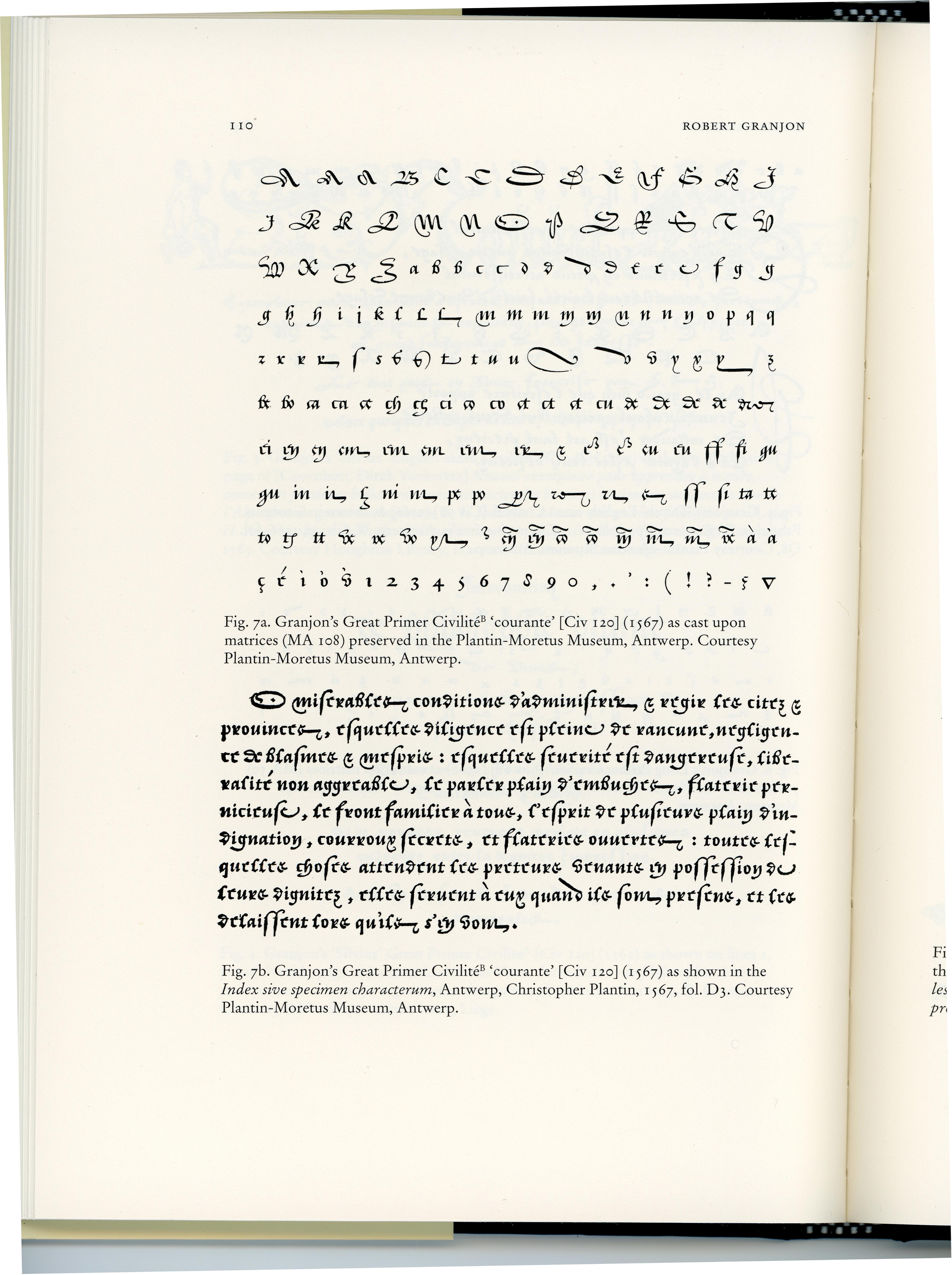


All pages reproduced from Robert Granjon, letter-cutter.
1Granjon would today be called a “type designer”, but that term was not used until the twentieth century. Vervliet instead uses “letter-cutter” signifying the material technology of type employed from the fifteenth through the nineteenth century, when types were created by skilled artists who used hard steel engraving tools and files to cut and shape the forms of letters at actual size in steel punches. The punches were struck into copper matrices, producing concave impressions of the letters. From the matrices, types were cast in lead alloy, with the letter forms in relief, to be inked and impressed onto paper in printing. A common term for those type artists has been “punch-cutter”, which denotes the technique but omits the art. A sculptor analogously described might be called a “marble cutter” or “clay shaper”, and a painter, a “color dauber” or “pigment brusher”.