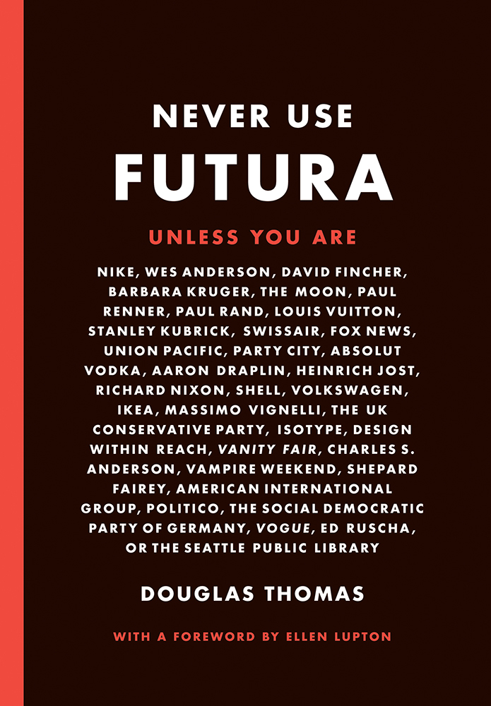
The only extraterrestrial body visited by humans has a plaque with the proud words WE CAME IN PEACE FOR ALL MANKIND and signatures of Neil Armstrong, Michael Collins, Edwin Aldrin, & Richard Nixon. This plaque is typeset in Futura (Figure 1), a typeface created by German designer Paul Renner in 1927 and popularized by a German company Bauer Type Foundry. Four decades later the typeface was so ubiquitous, that its use on NASA documents, including the famous plaque, became a matter of course: astronauts were required to quickly read and understand instructions, so a familiar readable typeface was chosen. Today this ubiquitousness works against the typeface: it is often considered overused, prompting the advice Never use Futura by some experts. This advice is boldly used as a title by a book by Douglas Thomas—followed by the sly unless you are, and a long list of distinguished companies on the title page.
The book is based on the author’s Master’s thesis at the University of Chicago and is a well-researched and generously illustrated treatise on the history of Futura. One of the most important questions Thomas tries to answer in his book is why the typeface became so popular. He argues that Futura fortuitously combined the bold modernist simplicity of geometric sans serif and a number of well-thought-out features based on the traditions of font design. Among these features are the classical proportions of the typeface; the subtle variations of height (the sharp tops of capital A and W are slightly above the other capital letters to create a visual uniformity of height) and pen width (the bowls of a, d, p become slightly thinner when they touch the stems). These almost imperceptible features make the typeface alive rather than mechanistic and cold.
The author is fascinated by the way the history of Futura is intertwined with the history of the 20th century. Due to its German origins, Futura was an object of propaganda in the USA: “By buying German fonts you help Nazis”, as American foundries that sold their own clones of Futura wrote in their advertisements. Nevertheless, as Thomas shows, many US Army materials were set in Futura and other typefaces of German origin. In Germany the fate of Futura was more complicated. The Nazi regime disliked Bauhaus and modernist art. The anti-fascist views of Paul Renner did not help either—the font designer was briefly arrested after Hitler took power (later he was able to emigrate to Switzerland).
Up to 1941 the official Nazi position on typography was that only black letter fonts were truly Aryan. However, in 1941 there was an abrupt change in the policy: black letter fonts were declared a Jewish corruption, and Germans were told to use only Roman fonts. This story is discussed in a paper by Yannis Haralambous (Typesetting Old German: Fraktur, Schwabacher, Gotisch and Initials, TUGboat, 12:1, 129–138, 1991, tug.org/TUGboat/tb12-1/tb31hara.pdf). By the way, this paper reproduces NSDAP order 2/41 introducing the change in the font policy. Interestingly enough, the letterhead of the order is typeset in black letter. At any rate, many later Nazi documents are printed in Futura. Thomas shows the identification card of a ghetto Jew typeset in Futura. Poignantly, several pages later he reproduces the proclamation about the internment of Japanese Americans typeset in the same font.
The general feel of Futura, its combination of modernity and familiarity, made it ideal for electoral copy. At one point almost all electoral materials were typeset in Futura or its clones; see Figure 2. In our more sophisticated times, top ticket candidates usually order bespoke typefaces for their campaigns—often a version of geometric sans serif. In the 2016 US presidential elections, Hillary Clinton had a custom made typeface Unity based on Sharp Sans, while many Republican candidates used Futura-based fonts (Chris Christie, Marco Rubio, Jeb Bush). Interestingly enough, the campaign of candidate Trump did not make any design choice, so Trump posters in different places used quite different fonts, mostly boldface. While the word TRUMP was most often typeset in Akzidenz-Grotesk Bold Extended, sometimes Microsoft’s default Arial was used. The typeface for the phrase “Make America Great Again” on Trump hats is the blandest Times New Roman, “almost an antichoice”, writes Thomas.
While the book has many similar sociological anecdotes, it also has many things one expects from a book about fonts, for example, a comparison of different digital versions of Futura (see, for example, the tracing of the letter S in Figure 3). It thoroughly explores Futura’s many uses, including art and advertising (Figure 4).
Included in the book is a fascinating photo essay Futura in the wild. An example of Futura in the mall is accompanied with an interesting observation that lighter faces subtly indicate more expensive wares (see Figure 5).


The book has a useful index and expansive end notes with the bibliography, showing its provenance in academic research. It is well designed and competently typeset. The body text is set in a serif font Lyon from Commercial Type. The chapter headings are typeset in Futura ND Bold from Neufville Digital, while captions are in Futura SB-Medium from Scangraphic. The foreword is written by Ellen Lupton, the author of a number of interesting books including Thinking with type. Even the blurbs on the back cover are creative: they are “authored” by various typefaces themselves.
This book is a good addition to any typography lover’s library.
Acknowledgment. This review was suggested by Dave Walden, who sent me his copy of the book.


