The participants of TUG2016 in Toronto had the rare treat of attending lectures by two prominent contemporary typographers, Robert Bringhurst and Chuck Bigelow. The Elements of Typographic Style by Bringhurst is considered one of the most influential treatises on book design; Hermann Zapf wished “to see this book become the Typographers’ Bible”.
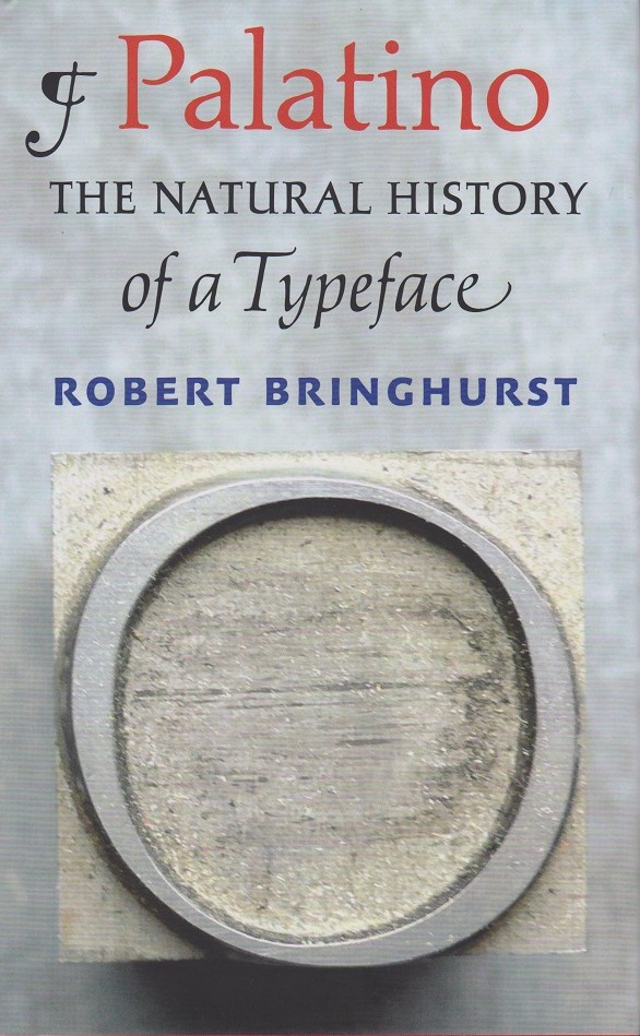
Interestingly enough, both Bringhurst and Bigelow discussed major typeface designs. The latter told the story of Lucida by Bigelow and Holmes, while the former discussed the Palatino family by Hermann Zapf. Bringhurst’s lecture could be considered a presentation of his book Palatino, published in a limited (order now) trade edition this fall by David R. Godine.
The name Hermann Zapf strikes many chords in the TeX community. He collaborated with DEK, and was until his death an honorary member of the TUG board, the Wizard of Fonts. Thus while a book by a great typographer about a great font designer is a gift to any bibliophile, this book has a special meaning for our community.
The book discusses the long evolution of the Palatino family by Zapf. It lists all known variants from No. 1, Palatino text Roman trial cutting (1949) to No. 112, Aldus Nova bold italic, released in True Type and Open Type in 2005 (the classification and enumeration are by Bringhurst). Hermann Zapf was notable for his eager embrace and understanding of new technologies, and Palatino fonts were made for many different typesetting systems: letterpress, Linotype, phototypesetting and many digital formats. TeX users are quite familiar with this font family. The printed version of this review is typeset in Adobe Palatino with LaTeX package mathpazo (using sc and osf options for real Small Caps and old style figures in text). This font remains one of the most elegant and noble fonts in modern digital typography.
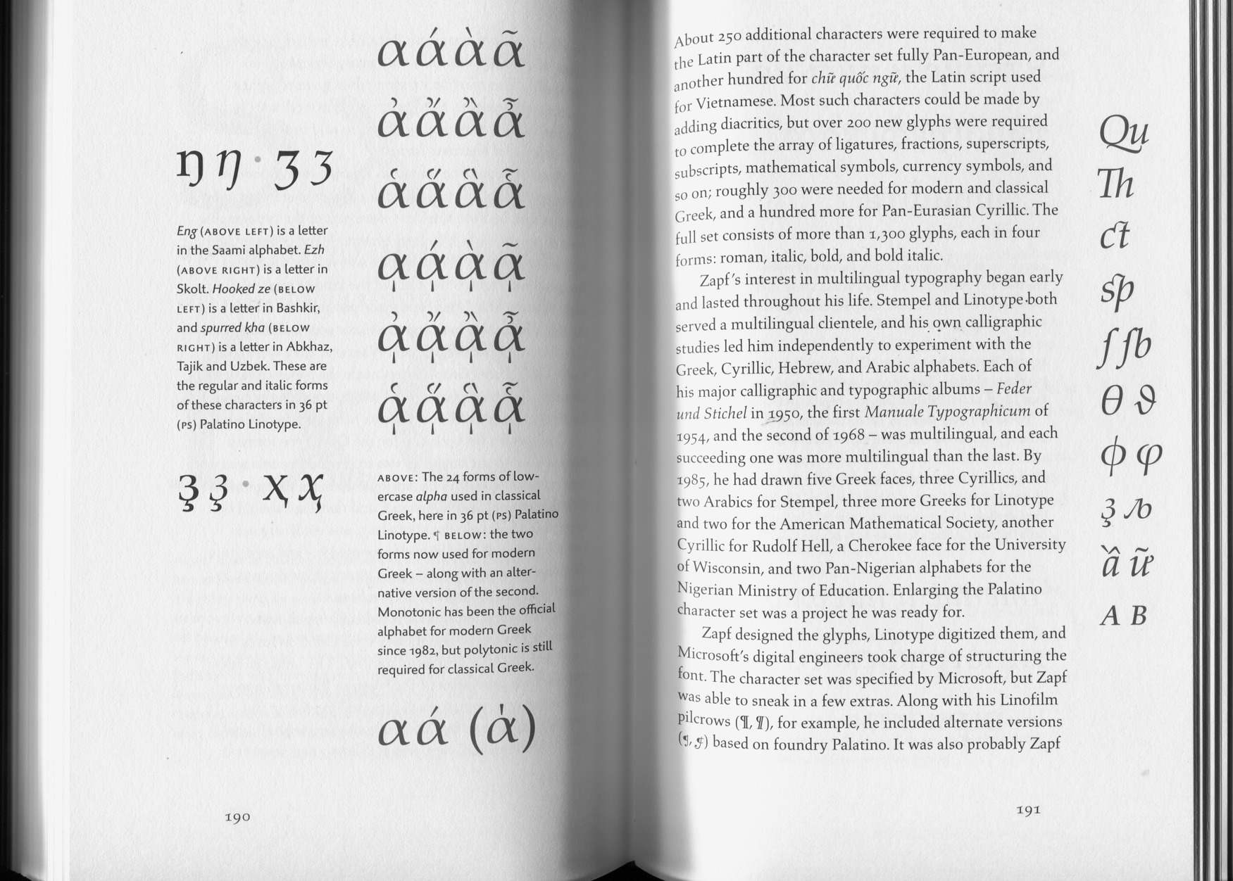
The technological changes require changes in the fonts themselves: the color and feel of copy produced by different means are quite different. The subtle changes in each redesign of Palatino show the care and skill of the great master Zapf. The font family includes Cyrillic and Greek letters as well as accented Latin ones, titling fonts, and many other typographic niceties.
The world of font design, even when we talk about one (admittedly large) family, is complex. A journey into this world requires a wise guide, generous to share his knowledge and experience with the reader. Robert Bringhurst is, without a doubt, such a guide. His book fortunately avoids the trap of becoming a catalog of font designs, interesting only to a few connoisseurs. Instead, the lucid explanations of the reasons behind the evolution of the design, the challenges and Zapf’s ingenuity in meeting them, make reading the book a wonderful experience. For example, he devotes several pages to study of just one character, the humble asterisk (*), and uncovers the beauty behind this modest typographic device.
Besides being a typographer, Robert Bringhurst is a renowned poet, and this shows in the book. For example, it is clearly seen in the description of the difference between the original Palatino and the later variation Aldus:
Aldus is not just narrower than Palatino, it also has a slightly lighter stroke and smaller x-height with taller ascenders. The transition from thick to thin (or from pull stroke to edge stroke), which in Palatino often have a slightly angular articulation, are more distinctly and consistently angular in Aldus. This gives a page of Aldus greater crispness—some would say coldness—than a page of Palatino. If Palatino is like a big, round, fully flavored red wine, then Aldus is like a flinty, dry white—equally deep but more narrow in flavor, and best served chilled, to keep the flavors closely focused. The proportions of the letters, with their modest eye and tall ascenders, emphasize their Italian humanist heritage, yet the hint of angularity in the round forms also alludes, ever so subtly, to the blackletter tradition. This allusion is reinforced by the shapes of Aldus apostrophe and quotation marks: they are long, sloped, tapered but uncurved—something rarely found in roman and italic but altogether typical of fraktur.
The same poetic eye shows in the best description of the difference between serifed and sans serif fonts I ever read:
Serifs—those little entry and exit strokes through which the writing hand and the reading eye like to find their way into and out of a letterform—are also a means by which letters tie themselves into a line: a form of graphic social bonding. They are as old as the letters themselves; but sanserif letters—the socially disengaged—are no younger.
Several good metaphors are used throughout the book, illuminating its main themes. Bringhurst compares the fonts to classic musical instruments like cellos and pianos. This metaphor becomes especially apt when he notes that it is difficult to judge some variants of Palatino because they were not actually used—as we cannot judge an instrument which was never played by a skilled musician.
Another important comparison is between typography and architecture. Bringhurst spends some time discussing entasis: a slight convexity or concavity of lines, in architecture and font design. His juxtaposition of the profile of classic columns and the elegant curves of the uppercase Roman “I” in Palatino is quite enlightening.
Bringhurst further compares classification of fonts to botany, where a naturalist must decide which plants are close relatives, which plants belong to different species and which are subspecies of the same kind. This is actually a fundamental metaphor for the book: not for nothing does the latter have the ambitious subtitle The natural history of a typeface. Bringhurst clearly sees his work as akin to the work of Linnaeus and Cuvier and makes us recall the times when the lines between a scientist, an artist and a poet were somewhat blurred.
As a poet, Bringhurst does not just reveal profound truths in nature and art. His eye sometimes turns to society, and again his observations are deep and revealing. For example, he discusses the changes made by Zapf to the fonts when the Stempel foundry prepared variants for sale in North America in the 1950s. To make the fonts closer to “the limits of American typographical taste”, Zapf revised nine letters and recut two ligatures, making the result “tamed to suit the goût américain.” Bringhurst discussed the changes, and then surprisingly notes the difference between the copy used to demonstrate the fonts:
The European specimens are full of quotations from Goethe and Shakespeare, sample title pages for books by Bertrand Russell and George Bernard Shaw, sample posters for art exhibitions, menus for five- and six-course meals, business cards for barristers and physicians, and snippets of typographic history. The American materials demonstrate instead how to use some of the world’s most elegant printing types to say such things as “Best 100-watt bulb ever” and “Buy wash-and-wear! Not wash-and-beware!”
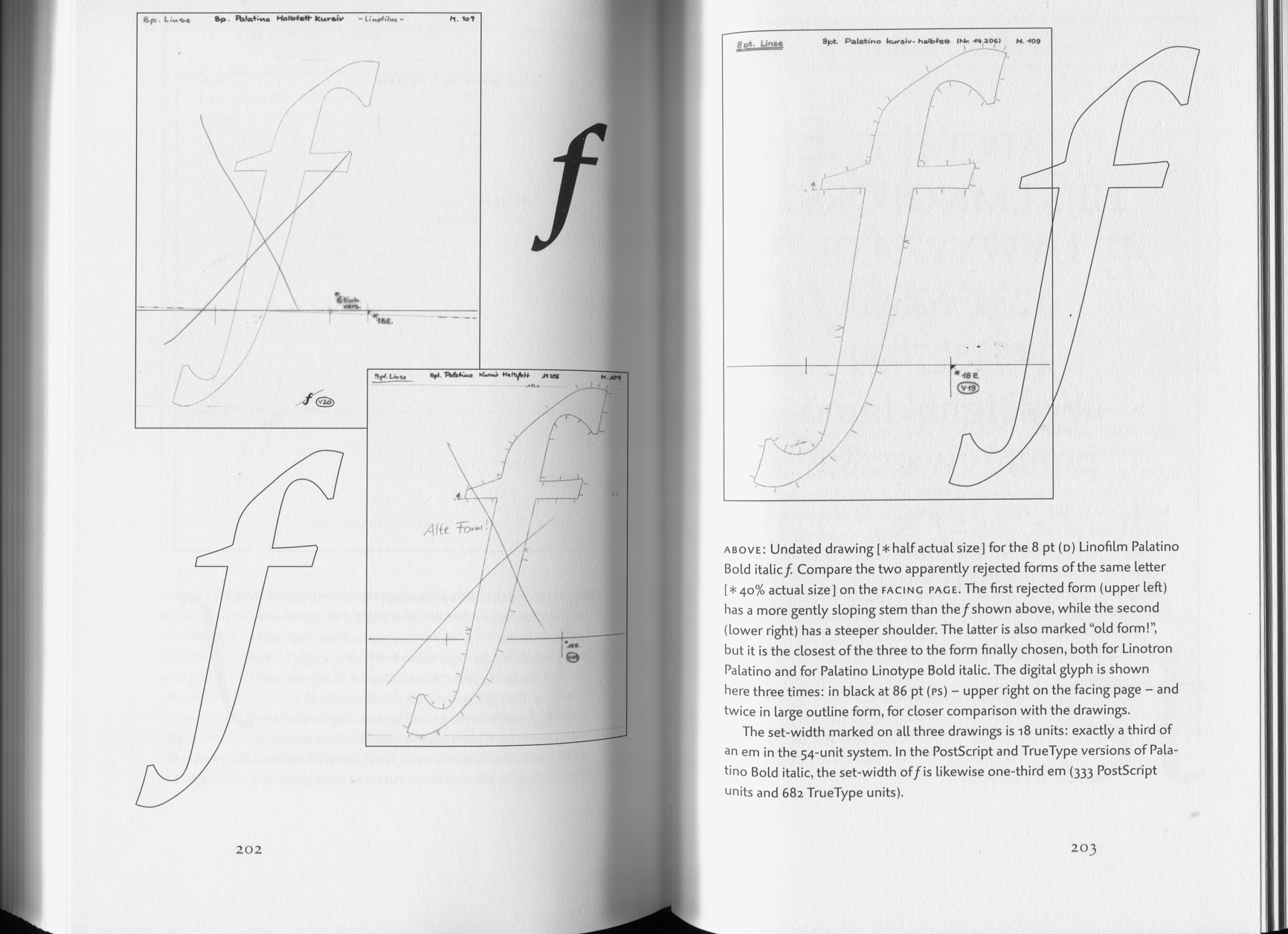
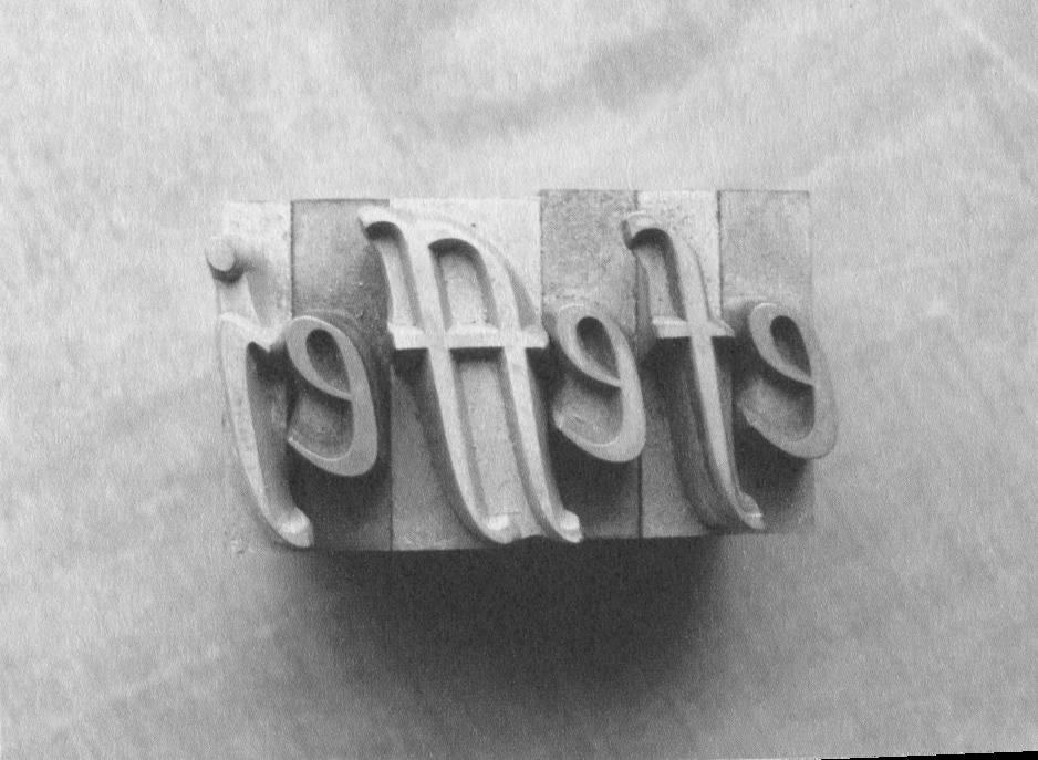
The book is very well illustrated. Font samples, drawings, photographs help the author to convey his thoughts clearly and convincingly (see, for example, Figure 1, showing the pages describing the making of Linofilm Palatino Bold Italic f). Many illustrations will warm the heart of a typophile; for example, the one in Figure 2 shows how kerning and ligatures were done in metal: sorts are shaved on the sides to effect kerning and there are separate sorts for ligature glyphs.
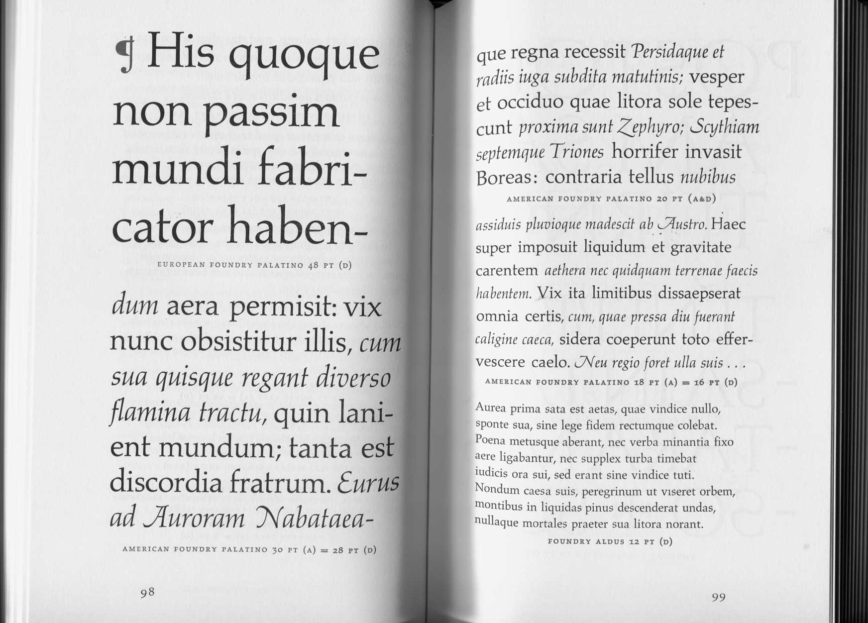
The book was designed by Robert Bringhurst himself, and the design is daring and beautiful. It uses margins for a wonderful variety of illustrations; full page and part-page ones subtly interplay, as shown in Figure 3. The main text is typeset in Aldus Buchschrift and Palatino Sans. The book includes letterpress pages printed by the well regarded book designer and artist Jerry Kelly (Figure 4).
The publisher of the book, David R. Godine, is also well known among bibliophiles. We have reviewed several books from his catalogue in these pages, and an article about his work appeared in a recent issue (David Walden, Note on the publisher of the Bodoni book: David R. Godine, TUGboat 37:1, pp. 97–98, 2016, http://tug.org/TUGboat/tb37-1/tb115walden.pdf). The book is beautifully printed and bound.
Of course, even the best book ever printed could be made better. I missed two features in this book, one minor, one more important. First, the list of fonts and font variants in the end of this book would be more useful if accompanied by the page numbers where the font is discussed or shown. Second, if a font is a musical instrument, then a discussion of it is not complete without a sketch of musicians who played it and the pieces where it shone brightest. While it would be impossible to list all books and typesetters working with Palatino (which is more evidence of the greatness of Zapf’s creation), it could be interesting and useful to mention at least some notable publications that involved Palatino.
Still, these gripes are about the things that are not in the book. The things that are there, in my opinion, are more than sufficient to justify its price for any typophile, bibliophile or anyone interested in the history and art of making elegant fonts & beautiful books.