The Great East Japan Earthquake of 2011 lead to 15,883 deaths, 6,145 injured, and 2,671 people missing. It caused the meltdown at the Fukushima Daiichi nuclear disaster and incalculable damage to public health and the national economy. The way in which the consequences of the catastrophe were handled shows the amazing resilience of the Japanese people. The destroyed roads, buildings, and bridges are being restored, normal life is resumed. In particular, it is noteworthy that the exhibition of the calligraphy of Hermann and Gudrun Zapf, scheduled for March–April 2011 and postponed due to the catastrophe, opened as early as September of the same year. Only a small slip of paper, tucked in the catalog and correcting the dates, reminds us about the delay.
Several copies of this catalog found their way to the US. I bought one at RIT Press.
Of course reading a catalog is a pale substitute for actually visiting an exhibition. Still, the rich illustrations in this book are a real treasure for those who love beautiful letters.
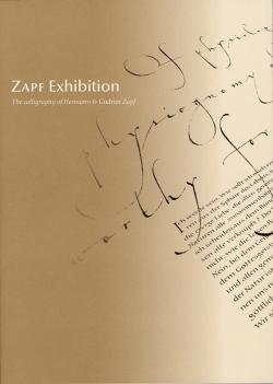
The works of Hermann Zapf are well known to the TeX community. He is a permanent honorary board member of TUG; many of his fonts are included in TeX distributions, and his algorithms influenced the development of modern TeX. Several of Hermann Zapf’s books demonstrate his calligraphy, including the beautiful Alphabet Stories (reviewed in TUGboat 28:2). Gudrun Zapf, a great artist in her own right, is perhaps less known among TeX people—except for those who have read DEK’s 3:16 Bible Texts Illuminated, who may remember her beautiful rendering of 2 Thess. Thus some pages in the catalog are familiar to the aficionados of calligraphy and type, while others are refreshingly new.
Several illustrations from the catalog can be found at the web page http://www.typetoken.net/typeface/zapf-exhibition/. We reproduce below a quotation from Walter Crane by Hermann Zapf and a quotation from Hölderlin by Gudrun Zapf.


The book includes short introductory notes by Minako Sando & Akira Kobayashi and a biography of Hermann and Gudrun Zapf. Minako Sando is the director of the Japan Letter Arts Forum, while Akira Kobayashi is a renowned font designer who worked for many years with both Hermann and Gudrun Zapf.
As an appendix, the catalog reproduces some font design documents and photos of metal type, as if to remind us about the intimate connection between the written word and the printed word.
The book is well printed on beautiful paper. Fittingly, it is typeset in the fonts Optima Nova by Hermann Zapf and Akira Kobayashi, Diotima Classic by Gudrun Zapf and Akira Kobayashi, Hiragino Mincho by Akira Kobayashi and Aldus Nova by Hermann Zapf and Akira Kobayashi. The blending of Japanese and English type is perfect. The colors are reproduced carefully.
This is a beautiful book and a real gem for a collection of anybody interested in letters, calligraphy and book art.