I was excited when I heard about the book Just My Type. I have become increasingly interested in fonts as I have worked with TeX over the past 15 years, and in the past several years I have checked a couple of dozen books about type, type design, and type designers out of libraries and skimmed through them. Thus, when this book was published, I immediately bought a copy thinking it would be neat to read a book that written for a lay audience. As I initially dipped into the book, reading sections here and there, I enjoyed what I read. However, when I tried to read the book carefully cover to cover to do this review, my appreciation of the book wavered. It was hard going—too much information with too little logical connection over the book’s approximately 350 pages.
The book is a collection of essays (an introduction and 22 chapters averaging a little under 14 pages each) with titles such as:
Interleaved among the chapters are a dozen so-called “FontBreaks”, each three or so pages long and named after a font or class of fonts, for example
However, any of the chapters or FontBreaks may have information about fonts, font design, font designers, use of fonts, theories of fonts, and so on. The FontBreaks are also essays, albeit shorter than the chapter essays; and there is really no thread that ties these 35 chapter and FontBreak essays together or orders them in some logical way.
Thus, I think the book will appeal most to people who don’t have time or interest in pushing through a continuous coherent text and rather only seek to read one short type-related story at a time. It may be ideal for bedtime reading.
For me, with my modest but non-trivial background with and about fonts, some of the book’s stories recapitulated what I already knew (e.g., about Helvetica from watching Gary Hustwit’s documentary movie titled Helvetica). Some of the chapters added to what I already knew (e.g., more about the history of ampersands). Some of the chapters were on topics entirely new to me (e.g., the Type Archive founded and directed by Sue Shaw in South London—I want to visit this place). I also was tickled to read for the first time about the logo of the Beatles band. In a chapter titled “The Serif of Liverpool”, we learn about the origin of this logo text with its capital B followed by small caps with a long descender on the T:

As is typical in all of the book’s chapters, this chapter then goes on to other topics related to the initial theme of the essay—in this case, other famous logos in the rock world.
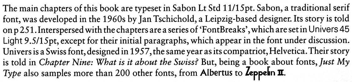
The book contains scads of specimens of different typefaces and fonts. The excerpt in figure 1 from the book’s copyright page explains a bit about the fonts used. In that text, the words “Univers 45 Light”, “Albertus”, and “Zeppelin II” are set in the mentioned font. (The rest of the paragraph is in Sabon.) The mentioned samples of “more than 200 other fonts” throughout the book are mostly only a word or two long—the name of the mentioned font, as here.
This display of type specimens throughout the book is impressive as a compositing feat (imagine having to make so many fonts available to one’s typesetting system for a single project). However, it lacks organization (and comparable samples of full alphabets) making it not so useful in terms of serving as a specimen book. The book does have an index (not always available in books written for lay readers), and this allows one to go from a font name to one or more book pages which may include a sample of the font.
The book also includes a three page bibliography of relevant books and a two page list of Internet resources. It would have been nice for a reader interested in digging deeper into the content of any of the essays if the book cited the relevant bibliographic items via footnotes or end notes from the main text. However, this is one more book where the designer (or publisher’s marketing department) apparently couldn’t allow such research aids lest they damage the book’s popularity. (I would think that a bibliography could include page references back to the main text that would to some extent provide the useful links without cluttering the main text with those unpopular superscript reference numbers.)
Two aspects of the book appear to be included to add graphical pizazz that I think fail to achieve a purpose in terms of providing usable information. There is a periodic-table layout of fonts inside the front and back covers of the book, taken from squidspot.com/Periodic˙Table˙of˙Typefaces.html. However, the author (or book designer) didn’t include enough information to make this chart useful to me. Then there is a foreword by Chip Kidd that is apparently supposed to show in a flashy way (2 pages of text, 14 pages of graphics, not much explanation) the use of a lot of different fonts. However, the foreword doesn’t connect well with the rest of the book. Perhaps the foreword would have impressed me more if I had ever before heard of Chip Kidd (Wikipedia suggests he is a well-known graphic designer). Or it might have said more to me if I already had a well-developed eye for graphic design.
As mentioned above, the book would have appealed to me more if there was some logical thread that flowed through the book, although I can imagine that was hard for the author to figure out given the many disparate topics he touches upon. Overall the book is an impressive effort given (it seems) that the author is more of a journalist writing books on a variety of non-fiction topics (simongarfield.com) than a long-time expert in the world of fonts. I can imagine that going from an interest in the topic through the study to write an entire book on the topic would have been a pretty educational exercise, and the author has chosen a nice subset of what he learned as stories to include in the book.
Perhaps one thread of continuity could have been the author telling us more about his background with type and how he pursued the information in this book. How much did he already know, how did he learn more, and what mental map did he have in mind as he wrote the book? I know that the author is supposed to keep himself out of the story, but including some information about his journey in collecting the information for this book might provide an interesting side story that would draw the reader along through the book (and perhaps give the reader some greater global mental picture of the world of type).
In any case, the book is what it is. I will put it on my book shelf as an informal adjunct to the few other (more formal) books on type I own and the others I will continue to get from the library from time to time. (In fact, there is little overlap between Just My Type and the two books I already have on my shelf, Bringhurst’s The Elements of Typographic Style and Felici’s The Complete Manual of Typography.) No doubt I will dip into Just My Type again occasionally to recall an interesting anecdote or use it as a potential one-shot resource (using the book’s index) when looking up something about fonts before consulting more specialized books.
My recommendation for others in the TeX world who may have about the same level of typeface expertise/ non-expertise that I have is to borrow the book from your public library first to see how you feel about it. Then buy it for your own library of books on fonts and their history and use if you think it will be a useful addition, or buy it to give as a gift to friends and relatives who are naive on the subject of typefaces. It does contain a lot of fascinating information for the right reader.